Source Filmmaker

Source Filmmaker

213 ratings
Ultimate Guide Series: Beginner Mistakes and jump to Advanced + Expert Resources
By E
This guide will showcase common "mistakes" beginners make when creating posters. It won't teach you how to use the program but instead provide with some knowledge to make your work look more competent, along with providing resources for further research.
4
3
2
3
   
Award
Favorite
Favorited
Unfavorite
Ultimate Guide Series: Beginner Mistakes and jump to Advanced + Expert Resources
Guide made by 8BEATER. Feel free to copy its parts and reupload it anywhere as long the author is credited.

This guide will showcase common "mistakes" beginners make when creating posters. It won't teach you how to use the program but instead provide with some knowledge to make your work look more competent, along with providing resources for further research.

The reason I called this the "Ultimate Guide Series" isn't because I'm good. While writing this guide I realized that I might have overestimated my abilities as an artist, as a user and as a person who can take the task of writing this guide. I'm not so sure in my abilities or even rights to teach anyone at all, at least for this subject. This guide's creation has dragged for way too much and I'm no longer able to continue making it, so I'll be releasing it in a half-finished state. Better than abandoning it forever. The real reason I called it the "Ultimate Guide Series" is because people of any experience can join in and add their own ideas and knowledge to it. I think I've constructed the right structure in order for you, Steam user here, to add ideas on specific topics, show other common beginner mistakes and add your own tips on further improvement as an artist. It's not a very good guide, so I must offer an apology. I stopped enjoying working in Source Filmmaker, so I treated writing this guide as a way to repay the amazing Source Filmmaker community for all its altruistic efforts in making others learn before departing from it forever.

Sorry for my rant. You came here to learn, after all. Well, if you're beginner, I'll make your artwork go from this:
To this:

That's a bit unrealistic, I won't guarantee making good artwork will be as easy as taking the tips from this guide, however you'll now at least be aware of the opportunities which can make your artwork look better.


As for anyone who think they're better than the posters that I make, well, just quickly skip over the rest of the guide and check out the expert tips section. I hope at least that will be useful.
Camera and scene settings
I will start off not with the most important things, but the most noticeable one when you see something made by a beginner, the camera (and general project settings).

--------

Let’s say this is our poster. What’s the first thing that’s caught by our eye? Of course it’s that motion blur. We used a sequence or an already-done animation so that’s why it appeared. When creating posters we usually want to completely disable it, and in case we do need one, it can be easily added in Photoshop with more control and quality.


Now, another important setting is the Depth of Field quality. This setting affects many different parts of the image, such as reducing the grain of the Ambient Occlusion, increasing the quality of shadows and more accurate blur with the Depth of Field setting.
Normally the amount of samples taken is 8, which is really low, so when we’re working the
preferable setting is 256 and 1024 for the final image. Of course, if your computer isn’t very fast or you’re making an animation, the setting can be reduced, but keep the impact of this setting in mind.

(zoom into the image to see the difference)


Another thing to note is Ambient Occlusion, it's more noticeable on a different picture.This setting imitates shadows by making areas with nearby geometry darker.
This effects of this setting depend on the result you're trying to achieve. Ambient Occlusion can work well with a realistic artstyle but doesn't mesh with cartoony aesthetics. Sometimes it can be glitchy around limb joints or with models that feature transparency. Use this setting wisely!
AO: ON vs. OFF


---

Those were all "Progressive Refinement Settings", now, onto the camera settings themselves.


I decreased the camera’s aperture because it appeared too blurry. My own taste.


I have also reduced the camera’s bloom scale (completely removed it, actually). It’s one of those things that can be added back during Photoshop with more control, so I have no regrets.


And there it is, our final product. If you compare it with what we had before


--------------------------------------------------


  • Team Fortress 2 characters have two types of models: HWM and Player. HWM models, found in Source Filmmaker’s folder. HWM characters have more detailed face settings, more accurate fingers. Player models generally run faster than HWM models, but this isn’t much of a worry since we’re not playing a game. Use HWM models whenever you can.
  • The “toneMapScale” setting on the camera will adjust the brightness of all light sources in the scene, including the map itself. It can be used to make the map brighter or darker without sacrificing the details like if you'd do it in post-production.

  • Please make your posters in 4K or higher. Even if you don’t want to release such a high quality version, it might be more useful later due to current compression technology and printing quality.
  • You can change the maximum and maximum allowed values for some settings by right-clicking it in the viewport and pressing “Remap Slider Range”.


-----


Field of view
Now we should transition onto our next topic sitting between camera and posing, Field of View.

Field of View is how wide the angle of the camera is. Field of View is one of the ways to make more objects seen in a frame. However, the downside to this is creating a fish-eye effect that might make the image look unpleasant. Another way to fit more objects on a screen would be moving the camera further away from the main object.

Here I'll try to demonstrate how changing the FOV along with the distance can showcase that fish-eye effect, while keeping the screen space occupied by scout the same.


Notice that despite the space occupied by the character remaining roughly the same, the background is made smaller. The further away the camera is and the more narrow the FOV is, the less depth an image has. A good artist always knows when to use which in order to get the intended effect.

FOV vs Distance Visualisation


Even if it seems like you can’t move the camera too far away without being obstructed by other objects on the map, if you think that a lower FOV benefits the picture, just try moving the entire scene to a different part of the map. Or if the camera isn’t located outside the map, you can use the NearZ slider from the “More Camera Settings” plugin to remove the parts that block the view. I promise, it might look not as bad as you think

-----------------------------


If you’re using a green screen, make sure to have the background and the foreground cameras have the same FOV, or the viewer might feel that something is wrong with the image.


Example of different FOV between the background and the object, from Tom Scott’s video on green screen: https://www.youtube.com/watch?v=E5HRvQNg4pQ


-------------------------------------

WARNING: THE FOLLOWING INFORMATION IS BASED ONLY ON MY OWN EXPERIENCE. TAKE IT WITH A GRAIN OF SALT, JUST LIKE THE REST OF THE GUIDE, AND REMEMBER THAT YOU CAN DO AN IMAGE ANY WAY YOU LIKE.

High FOV is often used to show intensity

Example of an image with high FOV done well (in my opinion)

Image 1.

I personally find high FOV to work great in images where the subject is posed around the viewer.
Imagine a sphere around the camera. The left camera on Image 1. has high FOV and is placed close to the character. The camera to the right has low FOV and is placed far from our object. The bigger the distance between our camera and our object, the bigger the radius is and the less the bend of the arc is for the same distance.
  • I find that it seems more natural if the characters are placed along this arc. If we have high FOV, the scout is more bent towards us.
  • But as we move away, that bent becomes almost negligible. That’s why if your character is standing straight, the second variant looks a bit nicer. But that’s just my opinion, not a fact, like anything related to art.

Notice as we moved back the camera, the depth of the image became less apparent. Fov can also be used to show intensity of an image. We decreased it and now it looks like Scout is just slightly off-balance, not jumping back with incredible force.


------------------------------------


There’s also a thing that a lot of people talk about and I feel like I should mention. It’s composition, or how things are distributed along the image. There’s a lot of techniques for “measuring” it in order to make a pleasing image, like rule of thirds or the golden ratio, however I personally don’t use them because they are too restrictive. These techniques might help you, but the only thing that I use is my own internal sense of composition.
Posing
The most important element in the majority of SFM posters is posing. When posing you’re most likely trying to replicate the real world and exaggerate it, so if you’re trying to make a picture that best expresses the action and the character, it’s important that you nail down these elements, as otherwise the picture will feel “off” to an average person.

We’ll start off with an already done pose which is supposed to showcase a punch.


Okay, what problems do I personally notice with this pose? (We’ll discuss each point more detail later)

  • The skeleton is mostly formed by straight lines.
  • Sharp angles, most noticeable with the left arm, right leg and neck/head.
  • No weight or flow, the fist is just a part of the picture, the rest of the body doesn’t frame it by having it, for example, be affected by the arm thrusted forwards.

So what’s the reason for why this image looks so dull? I’d say that the main fault is not looking at reference images and not using the methods I’ve already described.


Here’s a different pose. It’s not perfect. In fact, it requires some work, but I think it’s enough to illustrate some of my points.

WARNING: THESE TIPS ARE TAKEN FROM MY OWN PERSONAL EXPERIENCE AND I DO NOT HAVE A WAY TO PROVE WHY THIS IMAGE LOOKS NICER A CERTAIN WAY, SO PLEASE TAKE IT ALL WITH A GRAIN OF SALT. ESPECIALLY IF YOU THINK THE IMAGE IS PRETTIER A DIFFERENT WAY.


What made the second image look more energetic and interesting?

  • There are very few perfectly straight lines in this pose. The curves are very exaggerated to fit the action

  • There are few sharp angles in the skeleton (yellow lines) to not make it look awkward.

  • Note that the curves should be sharp relative to the camera, not necessarily from any possible angle. Leave it to game animators who make actions look good from all angles.

  • The punch adds force to other parts of the model (most notably, the right shoulder is thrusted forward and the spine and left shoulder are twisted to the left as a reaction)

  • The upper part of the body seems to fall and lose balance. This is something we would avoid in static poses but it’s great for these extreme actions.

  • To create this pose I used some images of a punch found in Google, and this way I managed to copy some of their parts.


------------------------------------------


Let's take a look at a different shot


What are the problems with this image?

  • First of all, every part of the body is straight, there’s no curvature in it, no dynamic.

  • Even though it’s meant to be a resting pose, the scout's shoulders are slightly hung in the air which makes them look incredibly stressed, even though he isn't actively doing anything right now.

  • The pose is perfectly symmetric. It means that you can look at just one side and already guess about the other. I do not recommend using symmetry when posing a character unless other elements of the poster contrast with this symmetry.
    • Even though the character posing is entirely symmetric in this picture, different light sources make all sides look unique and interesting.

  • Extremely subjective, I doubt this is true, but: eyes usually point in the direction we want to look at. But if the character looks at us, where do we look? Looking directly into someone’s eyes isn’t very common in everyday life: even when talking, we tend to focus on the eye’s movements, not eyeballs themselves.
    • A different uncanny photo(shop), this time from real life, also combined with the fisheye effect we discussed previously.


Now, I don't know about, but this picture looks much better to me now


  • The only things changed are the camera angle and the legs, the rest of the pose stays the same. As I said again, the rest of the body doesn’t matter as long as it looks well to the camera.
  • The shoulders aren’t changed but thanks to this camera angle, there isn’t a very sharp angle between them and the neck.
  • Symmetry? No! Every side looks different.
  • Eyes don’t stare at me anymore.

So, what else can we take away from this?

Find reference images and try to pose the character around them. If you started your pose from the beginning, don’t try to fix it with references. Start everything all over and make it look similar.

--------------------------------


  • You might already know the difference between a standard rig and an IK rig (valve_biped_simple), so use it! I usually make big changes with an IK rig and other specific changes like stretching and character-specific bones with the default rig.

  • There are some bones that you can move but aren’t so obvious. You can rotate the shoulders (collar), hips (in IK mode) and toes. In default mode you can also change some character-specific bones, like dogchains or hat placement.

  • Pose your fingers! It’s also a part of the character, and a very important one, as we use them really often in everyday life. They can also be parts of the curves I described earlier, leading the eyes towards a particular object.
    • Fingers also can be posed when using valve_biped_simple, but they have to be manually enabled in the Animation Set Editor.

  • You can hold shift and drag a bone to make it stick to the nearest surface. Very useful for feet and basetransform.
Stop treading in place
It's not a separate section, it applies to posing, I just wanted to catch your attention because you must know it.

There’s a very important thing that I need to tell you which will stop you from constantly making mistakes and instead will teach you how to find them and fix them immediately. I learned to use it relatively recently, so listen carefully:

Our brains naturally get accustomed to artwork we create because we spend a lot of time looking at it, which might not be the best thing for a different person who looks at it for 2 seconds while scrolling their social media feed (and for a person who looks at it for half an hour, that's the same.

  • If you constantly look at the same image there will inevitably be a time when you stop thinking rationally and start focusing on useless things, ignoring the real problems.

  • If you’re constantly changing your poses without necessarily making it better, try to direct your attention towards something different for a short time, like doing the background or moving the props.

  • Another great technique would be copying the image and pasting it in some other program, like Paint…

  • or completely mirroring the image in an editor. That way your brain perceives this image as a brand new one...

  • or opening it on a different device

  • Make friends with some other person who makes artwork or can critique it well; their advice will be really useful.

  • Take a break!

If you notice you're constantly doing useless changes, the most important thing is for you to notice it and adjust, not waste your time on effort on nothing.


[[[ This section was written from my own experience and I feel like it can be expanded further. If you have some advice of your own, share it in the comments or directly with me ]]]
Lighting

Okay, we have our pose but let’s add lighting. Lighting in SFM is different from many 3D programs like Blender as there’s no ray tracing available, and instead it’s our job to emulate light’s behavior using various tools that SFM offers us.
At this point you must be familiar with types of lights in the program. There’s the map lighting which is pre-baked into the area and can’t be tweaked without the usage of a level editor like Hammer, and there’s also the dynamic SFM lights you’ve used before. Default lights only light the surface, while volumetric lights also show the path they traveled through the air, giving the scene more depth.

  • Just in case, before we proceed, I want to make sure that everyone who reads this knows that you can drag the light from the Element Viewer into the Viewport and control it from first person like a camera. I’ve just seen some people who didn’t know that, it just makes everything 10x easier.


The most typical lighting setup consists of three parts: main light, ambient light and rimlight. Here I’ll try to showcase each light’s role and settings.
Lighting - Main light
Main Light: Imagine it as the sun. Its main function is casting striking shadows and highlighting the important parts of the model from the front.

  • Main light placement:

    • Main lights usually light the whole model. Don’t create a separate one just for the head or just for the body. One, maximum two - it’s enough.

    • Place main lights in places which you think will create the most interesting shadows.

    • Have them highlight a model’s important places, like the face or the item held to make it contrast from the rest of the environment.

      • Or do the complete opposite: have the whole model lit except for the important parts, the darkness will still contrast with the rest of the parts. Just keep in mind that darker areas are harder to see: it’s the contrast that matters, not light.


  • Main light notable settings:
    • Intensity (Brightness of the light). I like setting it to pretty low, lower than 0.1
    • horizontalFov and verticalFov: the field of view of your light. Imagine it as a camera that casts light.
    • radius It’s a pretty important setting that I didn’t know about until recently. It controls how big your light source is - not the brightness, the scale. Low radius is similar to light from a flashlight with harsh shadows, and high radius is equal to a screen of light.
      • radius of 0
      • radius of 1
      • Usually you’d need something closer to a value of 0.1 to imitate the sun and 0.01 for artificial lights. Of course, if it’s something as big as a computer screen or lighting from the nearby walls, you might use a bigger value.
    • shadowFilterSize - how blurry your shadows are. It is only really useful if you use a very-very low radius of light.
    • shadowAtten - how dark your shadows are, just the color.
      farZAtten - how far your light can reach. It’s useful if you want to light only one from the front model and not touch the one in the back.
    • color - self explanatory. I don’t recommend making lights of fully one color, as in the real world it’s mostly just white with a shade of something (yellow for sun; blue for lamps).


NOTE: Keep in mind that for the most accurate preview of lighting you should
select the clip editor, as detailed shadows with effects like radius aren’t accessible in other modes:
Lighting - Ambient Light
Ambient light: In real life, light bounces from nearby objects like floor and walls and goes through skin, scattering in the process, but lights in SFM are much simpler and can’t do that. Ambient lights take the role of trying to imitate these effects along with adjusting the mood of the whole poster.


Light going through skin

  • Ambient light placement
    • Place it in front of the camera but from a different direction than the main light, so that it covers the completely black shadows and makes them look more believable.
    • The amount of lights can be any you want, just make sure not to make the lighting completely flat in the process.
    • Don’t make it completely remove the shadows casted by the main light, make it compliment them.

  • Ambient light important settings:
    • radius. As you’re trying to emulate the light bouncing back and not a single light source, I recommend to set it higher in order to make sure everything is lit and no unnecessary shadows are cast.
    • color: I like to set it to yellow as that’s usually the color of the scattered light that goes through skin. Other possible colors include:
      • Blue or the color of the current sky
      • Color of the nearby object if it takes a lot of space and it’s close to the main object.
    • intensity. Do not make it too bright!! Something around 0.02-0.03 is more than enough to compensate for your black shadows.
      • Nice lighting
      • Too bright: shadows are not tinted but absolutely destroyed


  • Remember, the important thing isn’t how the ambient looks by itself, but how well it looks together with the main light. If it doesn’t turn out well, try something else.
Lighting - Rim light
Rim lights are placed in the back of the main object and their main purpose isn’t making the lighting realistic but just highlighting the silhouette of the character. A well-made rim light will make the pose more expressive and have the image have more depth.

  • Rim light placement:
    • Rim lights are placed behind the main object and the areas you want to highlight.
    • The amount of lights can be anything you want, the main part is a great silhouette.

  • Rim light settings:
    • intensity: Put it as bright as you want, as the main thing is the contrast from the background and the rest of the character. Most likely you won’t be lighting anything important with it.
    • radius: The radius greatly depends on your style. If you want something cartoony, with really sharp shadows, set it to low, but with more realistic posters it doesn’t look so great:
      • Radius 0
      • Radius 0.9
    • shadowFilterSize: It helps you get finer control over the sharpness of the shadows that radius won’t give you. Don't confuse it with radius: radius makes the light source itself bigger or smaller, bluriness of the shadows is just one of the consequences of that; shadowFilterSize does only one thing: it blurs shadows, that's it.
    • Constant attenuation works like a flag. If it above a certain value, the light will never fall-off and will keep its brightness with any distance. I mention this setting here as it can be sometimes pretty useful for creating incredibly sharp rim lights.
      Constant attenuation OFF and ON
      • shadowAtten: darkness of the shadows, just how black it is
      • color: Choose it for your own taste but I like to set it to the color of the main light or of something that is in the background.


  • Now I’ll just toggle each light one-by-one in case it’ll be useful to any of you:

The fist light is pretty important, as that helps add further detail to the main part of the image and make it more expressive.


And there we have it, our final image. Of course, it’s not perfect, but I think it’s enough for you to understand the typical lighting setup. You could add volumetric lights to add depth to the scene, slightly tweak some other settings, but that’ll be enough for now.

Remember, the most important thing about a light is not how well each separate one looks like, but how they shape the poster and light the character. Think about the whole picture, not the parts of it.


Expert tips

Trying to improve a beginner’s poster
For this section I’ve provided a simple poster that illustrates some of the mistakes made by a beginner and we’ll try to fix them. We won’t do the posing for now, only the lighting and camera work.
   
​    
Okay, let’s find out what’s wrong with this image. First of all, let’s get rid of that fish-eye effect and place the camera further from our character.
   
   
The colors of these lights are far too extreme for normal situations. It seems as if our soldier is lit by a police alarm siren. We can either:
  • Increase the other values of our lights. So for example, increase the green and blue values for the red one.
  • OR we could make the entire scene more red or blue to make it seem as if the whole scene is like that and it’s just weather.
  • But ideally we would like to do both of that.

   
Edit: I might have added a volumetric light at this stage, though can't verify it.

Okay, it seems to look more natural. But soldier looks a little bit too bland, what if we add rimlights to boost his silhouette?


But you can probably see an issue which I haven’t talked about. Look at soldier’s feet, or rather, the ground they’re standing on. He casts three separate shadows, that’s crazy! There are many ways to solve this problem:
  • We could reposition the light so that they cast shadows upward, where we don’t see them. However, this doesn’t work in every situation and we would have to redo the lighting from scratch to accommodate for this.
  • Of course, we could turn off shadows by right-clicking the light source and disabling shadows but that would make the model itself look less nice.
  • We could increase the radius but that would still change how the model is lit.
  • farZatten setting, that’s our solution!


There, no more triple shadows. We need only one

Well, we’re basically done here. However, there’s one thing that is just my own personal taste and you should take with a grain of salt. Actually, everything I wrote in this guide is my own opinion and not a fact, but this thing is especially.

I think that both lights are way too bright. I feel as if they both are competing for the title of the main light but in the end make the whole picture look less pleasant. It’s a fairly small difference but just changing the value of one light will benefit the image. Judge this for yourself.

Photoshop
Once you decide to proceed to the next level, Photoshop (or any other image-editing tool for that matter, like Gimp), will be your most important friend and you’ll easily spend as much, if not more time, in it, as in Source Filmmaker itself. In this tutorial I won’t teach you to use this program and won’t showcase all the potential uses of this program, as there are far too many, so this part will be pretty short. I’ll just list off some of the situations in which I used it.


  • Removing unnecessary or clipping elements, like bones here going through the suit. If you keep in mind the possibility to edit these parts in Photoshop while making a poster, you can take more risks and make the product more creative. This applies not only to model clipping, but to any aspect you can change later.

  • You can add things that weren’t supposed to be there, like the glass on this fridge model. You are free to edit any part of the poster and apply any effects without touching the rest of the image (blur behind the glass, color correction).


  • You can add some really cool particle effects; something of which SFM doesn’t have anything similar

  • You can add more rim lights to parts where they physically cannot exist or boost their brightness (In this case I’ve literally drawn the lights on top of the model, duplicated it and blurred, that’s it)


I think you already realized how powerful Photoshop is and how much it can change a poster. There are tons of things you can do with it. But there are some things you can’t, that are too hard. For me those things have always been paint-overs: the drawing on top of a character to give the poster a hand-drawn look. No matter how much I tried, how much I practiced, I always seem to fail at it and can’t point out the exact reason why it seems to look wrong.


What I want to tell you, is that, in any industry, if you can’t seem to figure out how you can do something, try to look at your own strengths and improve on them. I discovered that I’ll never be able to animate the movements as other creators and surely will never best them. However, I’d consider myself to be a person who knows a lot about Source Filmmaker and Source Engine, so I try to rely on my knowledge of the software to create interesting and unique posters and animation. A gimmick artist, if you say, but I’m proud of it. Steg is able to create paint-overs because he relies on his experience as a traditional artist. Every person is unique, so even if you aren’t able to do something as great as someone else can, try to do something as great as you can.

Although that doesn't mean you don't have to learn new skills. Think of this as your specialization and try to grow in your specialization and still learn in the main sphere.
Conclusions + Resources
I hope this guide helped you. Although I provided some tips, ways to fix common mistakes and general knowledge, the main purpose of this guide is to kick-start your journey into the complex but wonderful world of Source Filmmaker (or if you’re advanced, just share some knowledge). Until then, I really hope you found something useful here. If you have something new to share, or want to correct me, or say anything at all, feel free to post it in the comment section. Thank you for reading, goodbye.

https://steamhost.cn/steamcommunity_com/sharedfiles/filedetails/?id=2898798716
Link to a separate guide because it gets too big here.
5 Comments
Dreamcast 31 Jan, 2023 @ 7:32pm 
I wish I had this guide 4 years ago. But I'm sure the people with 4 years left to go would be really happy to have this guide handy!
ETERNAL SLAYER 15 Jan, 2023 @ 1:05am 
I cannot thank you enough, you really got me out of my SFM funk with this guide. Especially the 'Stop treading in place' section. Well done!
E  [author] 8 Jan, 2023 @ 6:24am 
@yoyo120779 Could you please explain, what you mean by exporting?
-If you mean exporting an animation as a video file, I'd generally advise you to export as an image sequence and then combine those frames into a separate video file (I use Blender). The reason you'd do that is because there's no compression between frames (if you want, the video can be recombined later if you want better quality) and also the Quicktime player required to export as .MP4 which is a very outdated program, others say it might have risk to your computer.
-If you mean exporting animations to be later somewhere else in SFM or in another program, I believe this video might be helpful (although, I haven't watched it): https://www.youtube.com/watch?v=-orUMFOtt5Q
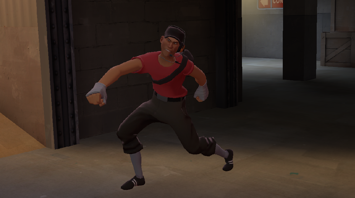
This one for TF2 taunts might help https://www.youtube.com/watch?v=ZS_7LQbrjjY
yoyo120779 7 Jan, 2023 @ 2:52am 
I just wanna ask how do you export animations, like for me it never worked
Douran 2.0 16 Dec, 2022 @ 4:04pm 
Correction. a ambient light is a light to replicate real life shadows. a ambient light is a light coming from the sky. how u would setup this light is to place it above your scene.
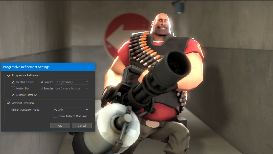
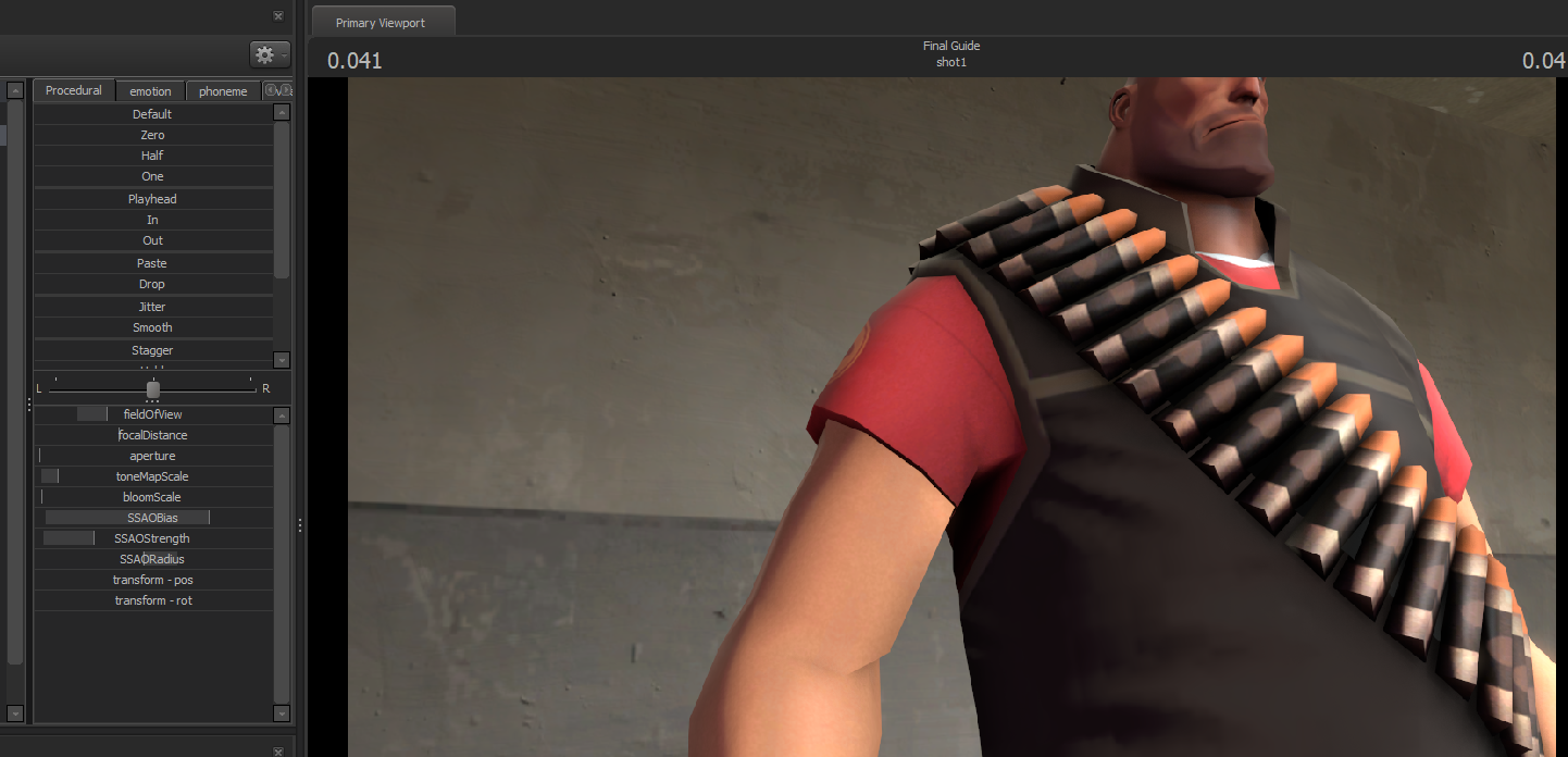
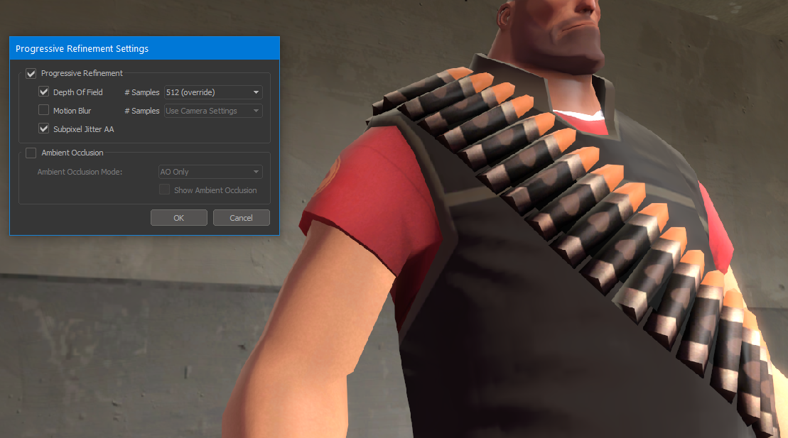
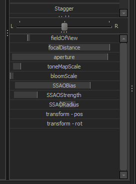
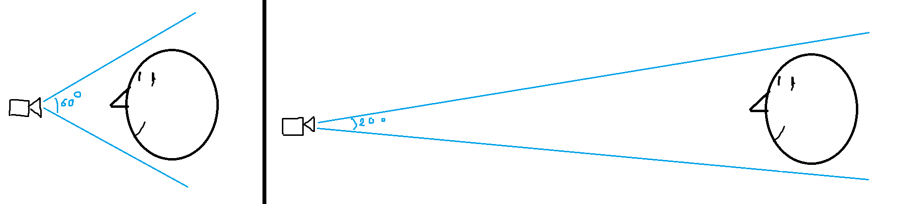
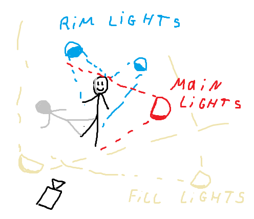
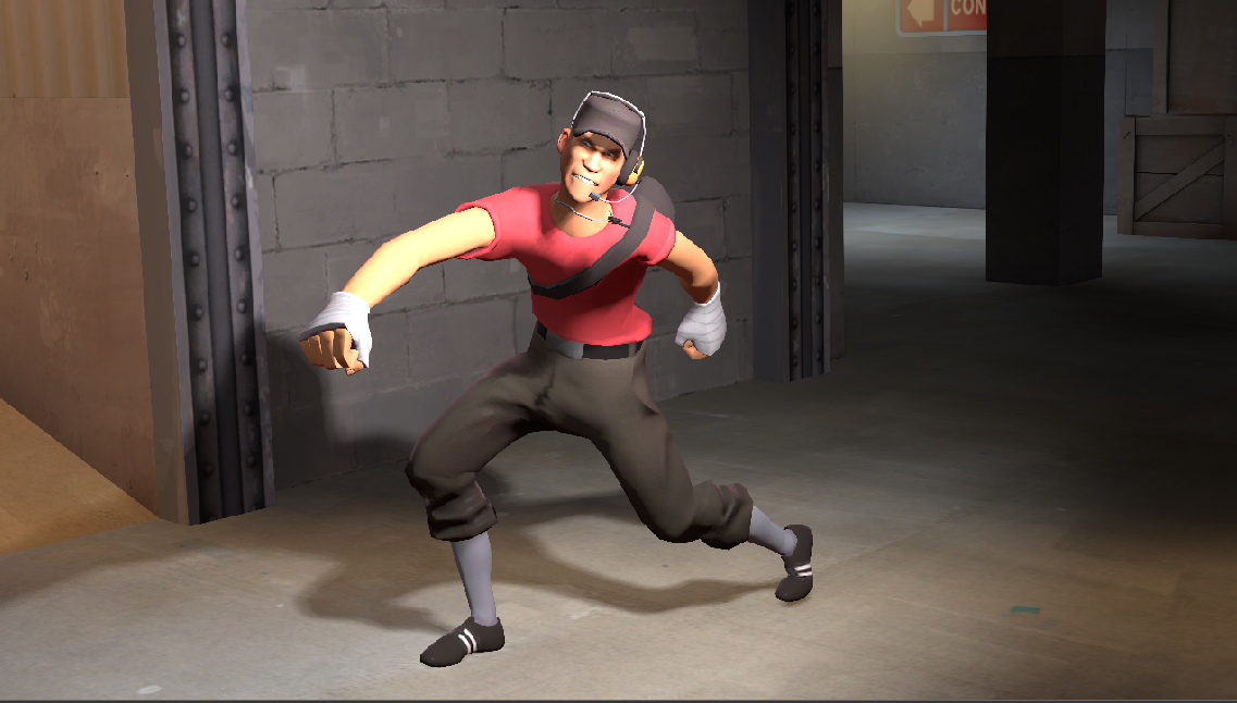
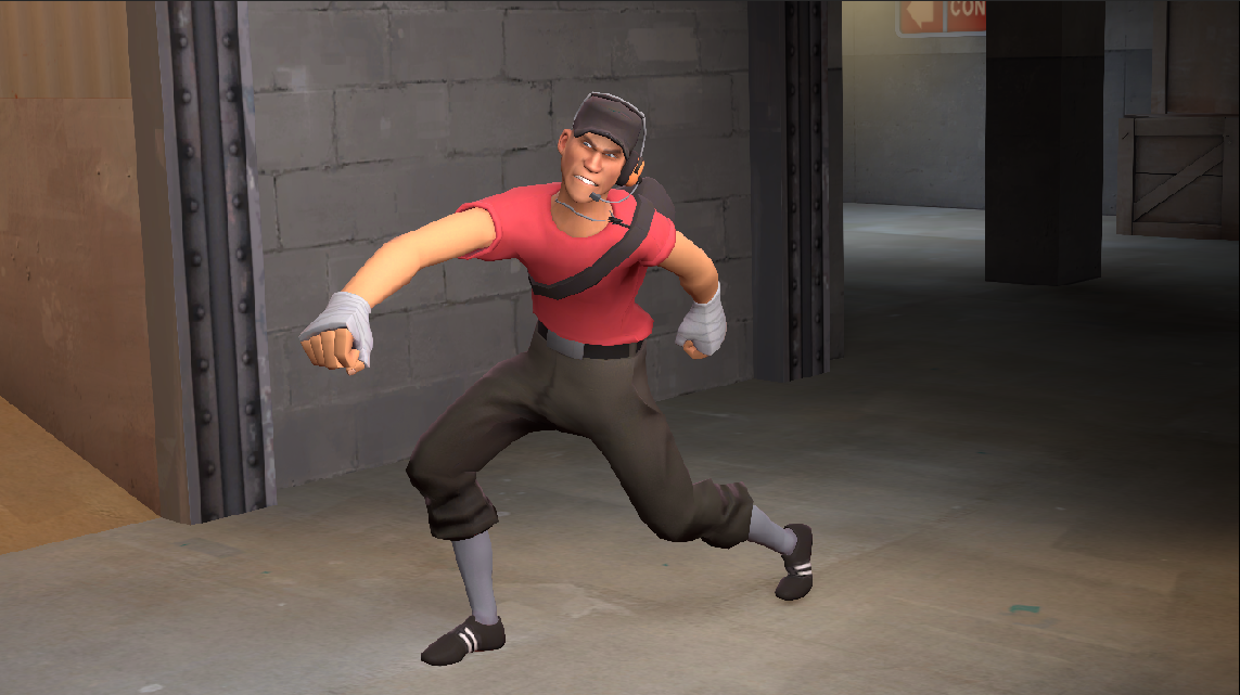
the amount of FOV u would use is 120-160.
And the amount of radius depends on your scene.
but for a basic scene u would use 250-350 radius (u may use more than that).
and u color your ambient light to the color of the sky (usually blue).